Thursday, August 31, 2006

Assignment 4: Patterns and Textures

Previous Assignment: Illusions and Reflections

One of the things that makes photography very interesting is the ability to capture patterns and textures. Usually, the human eye ignores them, just passing them over as a mishmash. But when you freeze them into a photograph, they can be very compelling.

A repeating pattern can be very pleasing to the eye, as you will see in the examples.

This assignment will incorporate (or can incorporate) all that you've learned in the previous assignments. It will also force you to focus perfectly. If your focus isn't in the right place, it will ruin the picture, at least for the texture portion of the assignment.

Again, you will probably do the best work here if you work in black and white, although color can be compelling as well.

Here are a few examples of interesting patterns:

Stairwell at UNL
White and Yellow Corn Dome at Memorial Stadium Hallway at Capitol

Note how, on all of these pictures, your eye doesn't want to leave the frame. It just wants to go around and around and see everything in it over and over again. This is one of the most basic composition strategies, and your goal should always be to capture the eye, move it around the frame, and never direct it outside the frame.

And here are a few examples of interesting textures:

Untitled Links II
(Note on the second one, however, that it's washed out a bit. Avoid this if possible.)
Sliding Door Stairs in Front of Mabel Lee Hall
Orange-Lime White Gerber Daisy

Did you notice how you can almost feel these pictures? That's what you need to go for when you're shooting textures!

Also, did you notice how I've used some of these pictures as examples before? That's part of what I'm trying to teach here. You should try to use what you've learned in each assignment and apply it to all the others. If you combine more than one trick you've learned in the same photo, you may surprise yourself at how good the results will be!

Now, go out, shoot, and share!

Next Assignment: Action!

Monday, August 28, 2006

I Hate Hue

If you read the post titled Color or Black and White?, you may have already tried to convert some of your color pictures to black and white. I bet your results weren't very pleasing. That's because converting a color picture to black and white doesn't give the same quality as you get with a black and white original.

That is, unless, you really know what you're doing.

The article entitled I Hate Hue from the website of Popular Photography & Imaging magazine should be a great help. They have two easy-to-follow processes to convert color images to black and white in PhotoShop.

If you don't have PhotoShop, you'll have to try to take a few pictures in black and white and color without changing any other settings, and moving the camera as little as possible.

Color or Black and White?

To be a good photographer, you absolutely must be a good photographer in black and white. Even if you prefer color in almost every circumstance, you still need to hone your skills in black and white first. Learning photography in color without first learning it in black and white is like trying to learn algebra without knowing basic arithmetic. Everything you learn about black and white photography will transfer to your color photography.

But once you get it down, how do you know whether to do a shot in black and white or in color? Take a look at this shot:

Chrome Tree

One person left this comment about the picture:
I've photographed it a couple times and had never thought of this angle in black and white!
I get a lot of comments like this, comments to the effect of "What made you think to do this in black and white?" This is the wrong question to be asking! In my mind, every time you set yourself up to take a shot, you should think of it as a black and white. Do black and white every time unless you have a really good reason to do it in color. The colors must be very compelling, either because they really pop, or because the muted tone adds something distinctive to the shot. If the color doesn't really add much of anything, do it in black and white!

Try an experiment for yourself if you can: take the same pictures in both black and white and color and compare them. Color photography does tend to hide flaws in the photo, but if it's a high quality picture it will usually look better in black and white. See for yourself with your own work!

Thursday, August 24, 2006

Assignment 3: Illusions and Reflections

Previous Assignment: Light and Shadow

One of the great things about photography is the ways that you can trick the lens and use it to confuse the eye. That's what the third assignment is all about. Don't forget the previous assignments when you're working here!

It is a little easier to trick the eye in black and white, but it's not quite as important that you work in black and white for this assignment.

One good way to trick the eye or confuse the viewer, or just to get a neat effect, is through the use of reflections. It's even better when there's a repetition of a pattern, as well. Here are some examples:

Black and Yellow Gazing Ball Crane Reflection Stairwell at Lincoln Capitol

Another way to confuse the eye is to use what you know about depth of field to induce a sense of vertigo, or to make something appear to have no depth when the eye recognizes the scene and wants to see depth. Remember, a wide aperture (low f-number) will give a sense of depth while a small aperture (high f-number) will make the image appear flat. Sometimes, when you want to create a feeling of depth, putting the camera at an odd angle will increase the effect of the illusion. Sometimes it's better to point straight down, though. Here are some more examples:

Drawers Untitled Staircase Vertigo Stairs in Front of Mabel Lee Hall

If you go back, you'll notice that "Black and Yellow" incorporates both of these techniques. If you can do that, you'll be in really good shape for this assignment! Also, notice that "Stairwell at Lincoln Capitol" and "Staircase Vertigo" use shadows as distinct design elements, like in the last assignment.

A tip: to increase the effect of your illusions, sometimes it's good to frame the image in such a way that it's difficult to tell what the subject of the picture is.

Now, go out, shoot, and share!

Next Assignment: Patterns and Textures

Monday, August 21, 2006

Taking Pictures Is Only Half the Battle

Going out and shooting is really only half the battle. And the better portion of what's left is sifting out the good from the bad. Let's say you have 20 pictures (or even 50 or more) of the same subject. You absolutely need to throw out the bad ones and only keep the good ones. Of any given subject, you should only keep 1-3 pictures from the shoot, and they should all be very different compositions if you keep more than one.

I know it's very hard to let go of some of your work if you really like it. But this is truly a part of the art of photography. Think of how the reputation of a mechanic would suffer if he did a good job on only 4 out of 5 cars. As a photographer, likewise, you can only get respect if you do a good job every time. You're not a true artist if you throw everything you have out there for public scrutiny.

Take for example this series of shots I took back in February. Can you guess which one I decided to keep and put my name on? (Answer at end of post.)


This is also why you need to learn to critique the work of others. Getting really, seriously critical of others' work will make it easier for you to be critical of your own work. A good place to give and receive strong critiques is on the Score Me group at Flickr. Not everyone will actually leave a critique, but they will give you a score from 8 to 10, and even that can be helpful.

The more you shoot, and the more pictures you throw out, the better your actual shooting will be next time. If you eliminate one composition on day 1, and you go out shooting again on day 2, you'll be more aware of what shots you are better off just skipping rather than trying.

But don't take this as advice to go easy on the shutter, especially if you have a digital camera. Particularly when you are just beginning to hone your craft, you will need to shoot a lot and make a lot of mistakes. That's what learning is made of.

And of course, you may have to throw out every single shot that you took of a given subject or on a given day. It happens, but don't let it stress you out.

And I didn't forget--this is the picture I decided to keep:

Untitled

Is that the one you would have picked? There's not necessarily a right or a wrong answer, here!

And finally, I'd like to invite everyone to join my Flickr group for this course. If you post there, you'll be sure to get an in-depth critique from me!

Thursday, August 17, 2006

Assignment 2: Light and Shadow

Previous Assignment: Basic Composition and the Rule of Thirds

I hope you learned something from the first assignment. If you haven't completed it yet, I suggest that you read it and try it out.

For this assignment, I want to recommend again that you use black and white film or switch your digital camera to black and white mode. On my digital camera, I can't switch to black and white if it's in automatic mode, so if your camera is like mine, it's time to stop cheating! You may need to switch to aperture priority mode, or shutter priority mode (I shoot almost exclusively in aperture priority mode--read your manual for details if you don't know how to do this). If you can't figure out how to do this, you will still be able to complete the assignment, but I don't think you'll be as pleased with the results (and you won't learn as much).

Part 1: Shadows as Distinct Design Elements

For the first part of your assignment, I want you to shoot a roll of film (or about 24-27 shots). For every one of these shots, I want you to go out and find a scene where shadows make interesting patterns or shapes. Don't forget the rule of thirds!!! If you can't follow it perfectly, that's ok.

You'll have the best luck with this assignment if you shoot when the sun is out and the light bright, but not directly overhead (don't shoot between 11:00 a.m. and 1:00 p.m). You may need to decrease the size of your aperture (in other words, increase the f-number) so you don't over-expose the picture.

Here are some examples from my work:

The One Ring Untitled Untitled Stairwell at Lincoln Capitol

I guess I tend to do these a lot in verticals. You won't have to do it that way. You'll notice that this technique often works best when there isn't a lot of detail in the image, so that the shadows stand out better. This is a good thing, because working in strong light can wash out details. Finally, here's an example of a horizontal:

Hallway at Capitol

Part 2: Distinctive Lighting

After you finish part 1 of this assignment, I want you to shoot another roll (or 24-27 shots), preferably again in black and white. This time, I want you to look at light and shadow as a tool to emphasize the elements of your picture and evoke a mood, rather than using them as a distinct design element.

Stone Angel
Here's a good example. Note how the interplay of light and shadow emphasizes the wings and the folds of the robe, while draping the angel's face in shadow, lending an element of mystery.

Spiral
Here's another example. Here the light and shadow emphasize the repetition of a pattern (repetition of patterns is a good subject for a future post). They also help to give character to the shape of the auger.

Making Ducks
And finally, note here how the light in the lower left hand corner draws your eye into the image. This picture is a little busy--try to avoid that, as a rule, but sometimes it can be used to good artistic effect. But do note how the business of this picture makes it somewhat less pleasing than the above two pictures. In photography, less truly is more.

Now it's time to go out, shoot, and share!

Next Assignment: Illusions and Reflections

Wednesday, August 16, 2006

Reverse Tunnel Vision

Tunnel vision is defined as "[v]ision in which the visual field is severely constricted, as from within a tunnel looking out". A tip I've often read is that you should give yourself the reverse problem when shooting.

What do I mean by this? Well, many people make the mistake when shooting of always putting the center of interest in the center of the frame. While sometimes this can be attractive, usually it's not. Try sticking a small square from a post-it note in the center of your LCD screen. If you use the camera's viewfinder, you might try putting a small dot of washable marker in the middle of it (you can clean it later). Try to make your compositions interesting regardless of this area, and you'll come back with amazing results.

Monday, August 14, 2006

Proper Exposure

Most people, even some very talented photographers, always use their camera in fully-automatic mode. When you shoot, I want to invite you to step out of that habit. You'll learn a lot, and you'll get a lot more control over your photography.

But to do that, you'll have to understand how it works.

An exposure is determined by three things: film speed (or ISO, or ASA), aperture, and shutter speed. If you don't have your camera with you, I recommend you go and grab it and try to find everything I'm talking about here. This is a long post, but this is absolutely essential knowledge, and it doesn't do you any good to understand only one of them, because they must work together.

Film Speed, or Digital ISO

A higher-speed film has more noticeable grain than a lower-speed film, but the higher one needs less light, and so it's faster. This is because film is made up of tiny crystals of some kind of silver compound. (Don't ask me what it is exactly, I'm not a chemist.) The larger the crystals, the faster the film, but the more noticeable they will be.

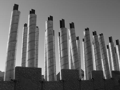
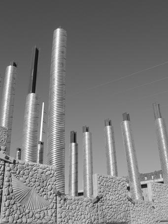
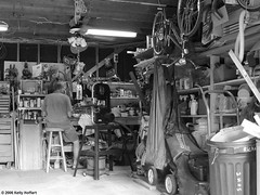
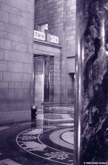
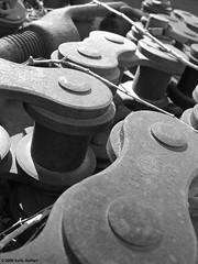
"But wait!" you say, "I use a digital camera." Whether you know it or not, your digital camera has an ISO setting on it that simulates this effect. (Don't ask me why, I'm not an electrical engineer.) You should be able to adjust it manually, within limits. My digital camera, a Canon Powershot A520, has ISO ranges from 50 to 400. You can see the difference between them here:

Lincoln Marathon 2006 Before the Service I

The first shot was in the 50 ISO setting, and the second one was in the 400 ISO setting. You'll be able to notice the difference more clearly if you click the images to enlarge them. The second one is much grainier. I was forced to switch the ISO setting because of the low light in the church--I was concerned about camera shake. More on that later.

One of the benefits of using a digital camera is that you can adjust film speed between each shot, if you want. But you may not be able to adjust it if you're in full manual mode, so get out of it!

Aperture

The aperture on your camera (represented by an f number, such as f2, f11, or f22) represents the amount of light that your camera allows to reach the film or digital sensor. The lower the number, the more light it lets in, and the faster your exposure will be. Typically, f22 is the smallest (and therefore the slowest) possible aperture, and it lets the least light into your camera.

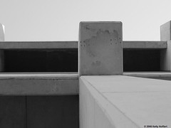
Like film speed, aperture affects proper exposure. But instead of affecting grain, aperture affects depth of field (or DOF). Depth of field represents the depth of the focal plane of the image. Sounds complicated, but it isn't. A faster aperture, such as f22, will have more of the image in focus. Many people like to operate that way, because they like images with a lot in focus. The downside of it, though, is that it makes the image appear to be more flat. I don't like this effect personally, although many people do. So I don't have any examples from my own work to illustrate this effect, but you can check out the f/22 group on Flickr to see some examples of flat pictures. Also, my digital camera is a point-and-shoot, so it only goes up to f8. If you have a point-and-shoot camera (not an SLR) it probably also doesn't go up to f22.

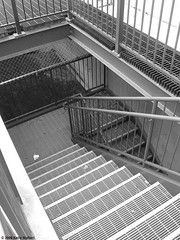
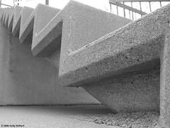
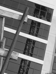
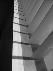
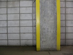
A wide aperture has the benefits of being both faster (because it allows more light into the camera) and of giving the picture the appearance of depth. This can be illustrated with this picture I took with my SLR film camera:

Old Railroad Bridge
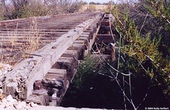
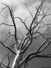
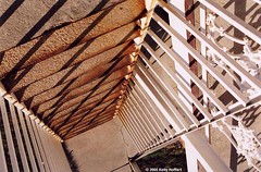
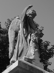
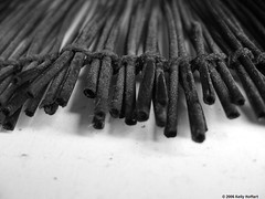
Note how the wide aperture makes the bridge appear to have more depth, to be disappearing into the background. Here's another example, this time in black and white from my digital camera:

Links III

You may notice as you mess around with your camera that if you zoom in, you can't get as wide of an aperture as when you are fully zoomed out. This is normal, so don't worry about it.

More on depth of field and its uses in another post some day.

Shutter Speed

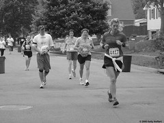
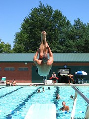
The final setting on your camera that affects exposure is shutter speed. This is how long the shutter stays open to allow light into the camera to hit the film or digital sensor. Like aperture and ISO, the shutter speed also has an additional effect: blur. Most of the time you'll want as fast a shutter speed as possible, especially with action shots like this one (at 1/800 second):

Flip Dive

But often, a slow shutter speed can be used to great artistic effect. Just check out the lights on these cars in this 2-second exposure:

The Morning Commute

Longer exposures are also very pleasing if you are taking pictures of running water, like waterfalls or streams. Professional fine art photographer David Fokos (a favorite of mine) uses exposures ranging from 20 seconds to a full hour to magnificent effect. But your camera may not be able to do that (my digital will not, and with my SLR I'd have to hold down the button).

The catch is (there's always a catch) that with slower shutter speeds, you won't be able to hold your camera by hand. When you shake the camera, you ruin the picture. How do you know when your camera is going to shake too much? A good rule of thumb is to take the inverse of your lens length, and if you go below that it's no good. For example, if you are shooting at 50mm zoom (fairly standard) you can shoot by hand at 1/50 of a second, and if you're at 28mm zoom (wide angle) you can go all the way down to 1/28th of a second. However, if you are zooming in really long--say, 100mm--it gets more difficult to hold the camera steady, and you'll have to go up to 1/100 of a second.

Combining All Three

Every time you take a shot, you're going to have to take into account all three: ISO, aperture (or f number), and shutter speed. Generally, it's best to set your ISO as slow as possible (lowest number) and, for the most part, forget about it. Then take into account your aperture. Do you want a shallow depth of field (for a greater feeling of depth) or more detail? Remember, a wider aperture (lower number) gives a greater feeling of depth and a shallower depth of field. And then, if you're shooting in fully manual mode, switch your shutter speed to whatever your light meter tells you is correct. Bracket if you're not sure (more on that another day).

Of course, it's not cheating if you use a priority mode on your camera. I use the aperture priority mode on my digital camera almost exclusively. It allows me to set the ISO (I almost always shoot at 50) and the aperture (I shoot as wide as possible) and it will automatically choose the correct shutter speed for me. If I don't agree with it, I can adjust the exposure compensation on my camera as well. You can also use a shutter priority mode on your camera, but I find this to be less useful.

It should be noted that each standard aperture or shutter setting is called a "stop". You will often hear an aperture setting referred to as an f-stop. Each step towards a larger aperture is called a stop, and lets twice as much light in. So f11 lets twice as much light in as f22. Likewise, each successively slower shutter speed is also called a stop, and lets twice as much light in. So 1/60 lets in twice as much light as 1/125 (the numbers are rounded off, that's why the math doesn't always work). Similarly, each basic film speed, as you go lower, requires twice as much light to achieve the same exposure. So 50 ISO requires twice as much light as 100 ISO, or four times as much as 200 ISO.

With this knowledge, we know that all of the following exposures are the same (in terms of how much light they put on the film or sensor):

50 ISO - f5.6 - 1/250
50 ISO - f11 - 1/125
50 ISO - f22 - 1/60
100 ISO - f5.6 - 1/500
100 ISO - f11 - 1/250
100 ISO - f22 - 1/125
200 ISO - f5.6 - 1/1000
200 ISO - f11 - 1/500
200 ISO - f22 - 1/250
400 ISO - f11 - 1/1000
400 ISO - f22 - 1/500

Next time you shoot, I hope you try to use this knowledge to your advantage. If you don't break out of your shell and make some mistakes, you'll never improve!

Friday, August 11, 2006

The First Amendment and Photography

Federal Parking Garage III

Click here to learn how my constitutional rights were almost violated.

Also, note how this photo follows the rule of thirds.

Thursday, August 10, 2006

Assignment 1: Basic Composition and the Rule of Thirds

For the first assignment, let's focus on basic composition. For this assignment, any camera will do. However, an SLR camera or a digital camera with an LCD screen are preferable (because you can see exactly what you're going to get).

You will also learn more if you work in black and white for this assignment. And, try to remember, at least for this assignment, that the picture isn't "of" anything. It's just a picture with pretty shapes and shades.

For this assignment, there will be absolutely no cropping. We're going to do what they call "cropping in camera," which means that everything you see in your viewfinder (or LCD screen) will add to the picture. This is all you need to know to complete this assignment. Read on if you want to complete it well.

The Rule of Thirds

The rule of thirds is the most basic composition rule in photography. It means, essentially, that you should imagine lines going through the frame at 1/3 and 2/3 of the way through. This can be horizontally, vertically, or both.


Just imagine these crosshairs on your viewfinder, and try to line things up with the lines or fill up each successive section with a different, interesting thing. Often, it's better to fill up just 1/3 of the image with one thing and 2/3 with something else. Believe me, your pictures will be three times as good just from following this advice.

Now, because a picture is worth a thousand words, some examples from my work:

Untitled
This is a photo that follows the rule in a purely horizontal way. Note how the upper 2/3 of the image is dark and the bottom 1/3 is light. Remember, the picture isn't "of" anything. It's just a picture with nice lines and shading.

Capitol with Marble Pillar
This picture gives you an example of how the rule of thirds can work vertically. The wall on the left is 1/3, the column on the right is 1/3, and the more open space in the middle is another 1/3.

Untitled
And finally, this picture is an example of how you can mix both vertical and horizontal lines. The picture is split into three different sections from top to bottom, but it also uses a strong vertical third (here, it's almost 1/2, but try not to push it this far until you get some more experience).

Now, go out, shoot, and share!

(When you complete the assignment, why don't you share it with the group's Flickr pool?)

Next Assignment: Light and Shadow

Welcome!

Welcome to An Open-Ended Course in Photography! I am your instructor, Kelly Hoffart, also known as Full Metal Photographer. On this blog I will post tips on improving your photography, as well as photographic assignments so we can learn together. This is intended to be an interactive experience, so be sure to complete as many assignments as you can. Share your results by leaving a link to your photograph with your comments in the thread for whichever assignments you have completed.

I will post all kinds of different assignments, simple and advanced, but I will start with the basics.

And if you got here late, feel free to complete older assignments or jump in at any point that you find interesting.

If you complete at least one assignment, I will add a link to the web page you have that's most relevant to photography (if you have a photoblog, that will be it, or your Flickr account, or any other blog where you regularly post photos).

NOTE: I am looking for someone to write articles on artificial lighting, or perhaps the professional side of photography, or anything else that you feel is missing from this site.

Index

This page serves as an index for the site.

Welcome!

Assignments
Basic Composition and the Rule of Thirds
Light and Shadow
Illusions and Reflections
Patterns and Textures
Action!
Less Is More
Putting It in Perspective
Leading Lines
Critique
Still Life
Do Something Different
A Challenge: Shoot Out the Window

Knowledge
Proper Exposure: Film Speed, Aperture, and Shutter Speed
Basic Lens Types
Digital "Zoom"
Light: Quality and Quantity
Image Stabilization
Advanced Composition and the Golden Ratio
History of Photography:Niépce to Eastman
Bokeh
Camera Types and Parallax Error

Quick Tips
Reverse Tunnel Vision
Color or Black and White?
Don't Be a Wuss
Always Take Your Camera
Add Drama by Cropping
Winter Photography
Christmas Pictures

How-To and Photoshop
I Hate Hue (color to black and white conversion)
Shedding Light on Dark Images
Floating in Space
Light Trails
Silhouettes
Vignetting
Split Toning
More on Toning
Make Redscale Film
Use Blend Modes for Effect

Other
Know Your Rights as a Photographer
Taking Pictures Is Only Half the Battle
No Excuses! (The Worst Mistake You Can Make)
Useful Flickr Groups
When You're Ready to Sell Your Work

Contributed by Readers
Falling Down, Skinning Knees, and Getting Dirty

Quotes
Henri Cartier-Bresson (on camera angles)
David Plowden (on "The Flatlands")
David Bailey (photographers versus painters)
Alan Bennett (photojournalists versus journalistic writers)
Diane Arbus (on happy accidents in photography)
Paul Caponigro ("attain[ing] a 'state of heart'")
Rineke Dijkstra (on enlarging and emphasizing a moment)
Anonymous (a good joke . . . or is it?)
David Plowden (on inspiration and motivation)
Jonathan Bailey (a photograph's independence from what it records)
Different Viewpoints (do you take a photograph, borrow it, or make it?)
Alfred Stieglitz (on the labels "amateur" and "professional")
Opposing Viewpoints (Is what you do after you click the shutter important?)