Assignment 9: Critique
Previous Assignment: Leading Lines
Let's try something a little bit different this week.
I've mentioned again and again what a great benefit you can get from critiquing the work of others. Yet in the group so far I've been the only one to give any critiques. I realized, though, that maybe you don't know what you're looking for in a critique. So here's a checklist that you can go down. Not all of these will necessarily apply in every case, but it's a good place to start. The technical issues apply to almost every picture, but the compositional and creative issues may not. The compositional issues are also creativity issues, but I've separated them because composition is always important to a photo, whereas creativity is much more subjective and complicated.
There might be a few jargon words in here that you may learn. I may come back and add to this list later, in case I missed something. After the checklist, I'll give a few famous examples for you to critique. If you figure out why they're good, or what's wrong with them, you'll be able to apply that knowledge in your own work.
The Checklist
Technical IssuesFocus: Is the picture in focus, or is the focus too "soft"? Is the focus in the most interesting place, or is it misplaced?
Depth of Field: Is the DoF appropriate to the picture? Is it too shallow, leaving interesting elements out of focus? Or is it too deep, allowing for too many distractions in the background?
Blur: Is the picture blurred from camera shake? Are moving objects in the picture blurred (sometimes this is good, sometimes not)?
Exposure: Is the picture underexposed (too dark)? Is it overexposed (too light)? Is the lighting too harsh? Are certain details "washed out" (areas too dark on the picture are less of a problem than areas that are too light)? Is the exposure uneven (some areas too dark, some too light)?
Tones (for monochrome pictures): Are the tones pleasing to the eye? If there is some added color, is it pleasing? If the picture has an overall color cast (such as blue or sepia), is it pleasing to the eye and appropriate to the subject?
Colors (for color pictures): Are the colors accurate, or was there a color shift? Are the colors vivid enough (in other words, is there enough saturation)? Are the colors muted, and if so, is it pleasing in this composition?
Distortion: Are lines in the image distorted due to the shape of the lens, and if so, is it distracting?
Bokeh: Is the bokeh pleasing to the eye? (This is rarely considered important to Westerners, but in Japan it's very important. I will post more on it at a later date.)
Compositional Issues
Overall: Is the overall composition pleasing? Does it follow the rule of thirds or the golden ratio?
Busy: Is the composition too busy?
Slant: Is there an unsettling or distracting slant to the picture, such as a tilted horizon (especially for water images)?
Distractions: Is there a distracting element in the image, such as a sign in the middle of a peaceful forest scene or a tree that seems to be growing out of a person's head?
Leading Lines: Does the photographer make good use of leading lines?
Patterns and Textures: Are there interesting patterns and/or textures in the image?
Light and Shadow: Is the lighting interesting and dramatic, or are there interesting shadows in the picture? (more on that here)
Illusions and Reflections: Are there interesting illusions and reflections in the picture?
Point of View: Has the photographer chosen an interesting POV, or is it dull and everyday? Does it send a message of power, size, or importance? Does it shed new light on the subject?
Perspective: Has the photographer made use of linear or spatial perspective?
Action: Is there interesting action in the image, and does the action move into, rather than out of, the picture?
Creativity Issues
Originality: Is this something new, or have we seen it a million times before?
Appropriateness: Were the photographers choices of how to display the subject appropriate to that subject, or did they do something inappropriate? Does the background complement the subject? Did the photographer give the picture a weird Photoshop treatment? For example, sepia is good for an old steam engine or someone dressed up as a cowboy, but not for high-tech computers or brand-new cars. Adding a glow to the picture is appropriate for a picture of a new mother and a baby, but not to a couple of guys hanging out.
Edginess: This is the flip side of appropriateness. If the photographer does something inappropriate, it may be to good effect. For example, posing a woman in a wedding dress provocatively is creative and unsettling, putting a typewriter into a modern office setting will catch people's attention, or showing a child from a low POV with a strong sense of depth will make him appear huge and strong rather than small and needy.
Breaking the Rules: Sometimes (although rarely), breaking a technical rule can send a powerful message, or set the picture apart. Did the photographer take any risks, and did they pay off?
Meaning: Does the picture have any meaning? Does it say something to you?
Et cetera: Is there anything else particularly creative about the picture?
The Examples
Here are a few pictures that you can critique using this checklist.
"Steerage" by Alfred Stieglitz
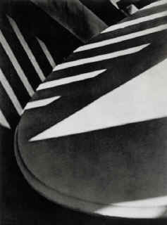
untitled by Paul Strand
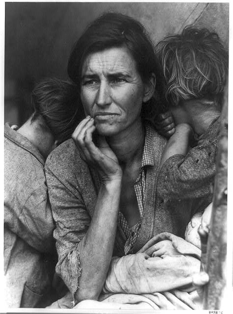
"Migrant Mother" by Dorothea Lange
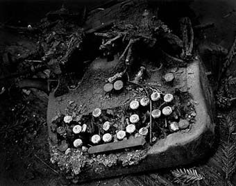
"Old Typewriter" by Wynn Bullock
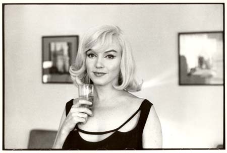
"Marilyn Monroe During the Making of 'The Misfits'" by Henri Cartier-Bresson
If you want, you can share your critiques in a comment in this thread, or share them with the group.
Next Assignment: Still Life
posted by Full Metal Attorney @ 11:27 AM
2 comments
![]()

2 Comments:
A good starting point for critique - I find it hard to get others to give good (or any!) criticism, so encourage this idea of yours. I think people are afraid of offending the photographer, so refrain from saying anything that isn't 100% complimentary. The C.A.F.E group on flickr is pretty good for critique though http://www.flickr.com/groups/cafe/
Thanks for your comment!
I forgot to mention that you should always critique the photo, not the photographer. Sometimes this line can be blurred. So make sure to avoid any comments that, though on the surface are critiquing the picture, are in fact insulting the photographer. Examples:
"amateurish" or "amateur"
"looks like it was taken by a little kid"
"unskilled"
As you can see, these comments sound like they're aimed at the photo, but they also imply something about the photographer. Avoid these kinds of comments.
Post a Comment
<< Home