Assignment 3: Illusions and Reflections
Previous Assignment: Light and Shadow
One of the great things about photography is the ways that you can trick the lens and use it to confuse the eye. That's what the third assignment is all about. Don't forget the previous assignments when you're working here!
It is a little easier to trick the eye in black and white, but it's not quite as important that you work in black and white for this assignment.
One good way to trick the eye or confuse the viewer, or just to get a neat effect, is through the use of reflections. It's even better when there's a repetition of a pattern, as well. Here are some examples:
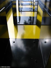
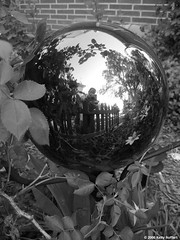
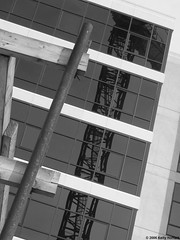
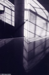
Another way to confuse the eye is to use what you know about depth of field to induce a sense of vertigo, or to make something appear to have no depth when the eye recognizes the scene and wants to see depth. Remember, a wide aperture (low f-number) will give a sense of depth while a small aperture (high f-number) will make the image appear flat. Sometimes, when you want to create a feeling of depth, putting the camera at an odd angle will increase the effect of the illusion. Sometimes it's better to point straight down, though. Here are some more examples:
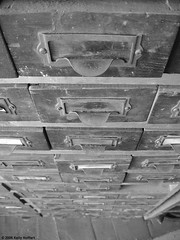
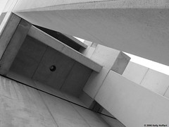
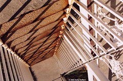
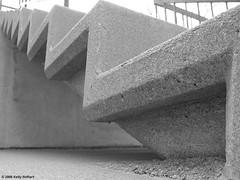
If you go back, you'll notice that "Black and Yellow" incorporates both of these techniques. If you can do that, you'll be in really good shape for this assignment! Also, notice that "Stairwell at Lincoln Capitol" and "Staircase Vertigo" use shadows as distinct design elements, like in the last assignment.
A tip: to increase the effect of your illusions, sometimes it's good to frame the image in such a way that it's difficult to tell what the subject of the picture is.
Now, go out, shoot, and share!
Next Assignment: Patterns and Textures

0 Comments:
Post a Comment
<< Home