How-To: Silhouettes
Instead of an assignment this week, I thought I’d share the story behind a picture, and maybe you can learn something about silhouettes from it.
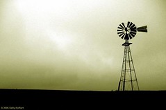
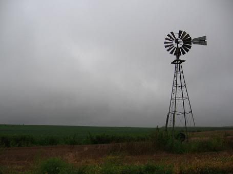 I took this back in August. I knew there was something I liked about it, but as you can see it’s terribly flawed: an almost complete lack of contrast. If you’ll remember the post on light quality and quantity, you’ll recall that too little light means too little contrast, and that’s the problem here. I had let it simmer for some time, hoping that I could figure out something to do with it.
I did.
I decided to turn it into a silhouette. I’ve seen many silhouette pictures. Many of them work. Many don’t. Why is it that some silhouettes are compelling, while others are dull? The answer is simple. Compelling silhouettes are easily recognizable, stark shapes. A windmill is perfect--Nebraska license plates had a windmill silhouette on them for years; they’re probably the most iconic structure to symbolize life on the plains. But the windmill here is only one example; others include people, some landmarks (e.g. the Eiffel Tower or the Washington Monument), fences, birds, and some other animals. There are many more to pick from. Contrast that with trees. Most trees almost never make a compelling silhouette, although there are exceptions.
The old-fashioned way to get a silhouette is to get a strong light source behind your subject, like in these images:
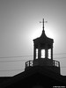
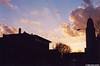
Sunrise and sunset are often the best times to do this. When you do it, it's a good idea to bracket (take a picture at the exposure your camera tells you, then another two stops lower and another two stops higher). But that’s not always an option, and here I’m trying to save an almost-good picture, not start from scratch.
So I opened up the picture in Photoshop. I wanted to change this to a black and white image first, to get the most mileage from going in the stark direction of a silhouette. But I wanted to change it to black and white in the best way possible. To figure that out, I went to the "Channels" tab in the "Layers" palette.
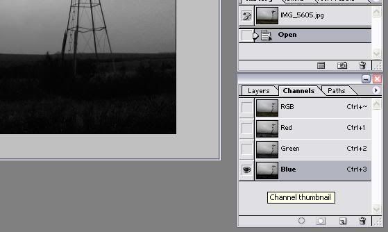
Here, I was looking for the channel that had the least range of values, i.e. a lot of black and white but not a lot of gray. I clicked red, green, and then blue, and found that the blue channel was what I was looking for. Most of the time, the red channel will have the most range and the blue channel the least, so this is no surprise.
Then I went to Image > Adjustments > Channel Mixer.
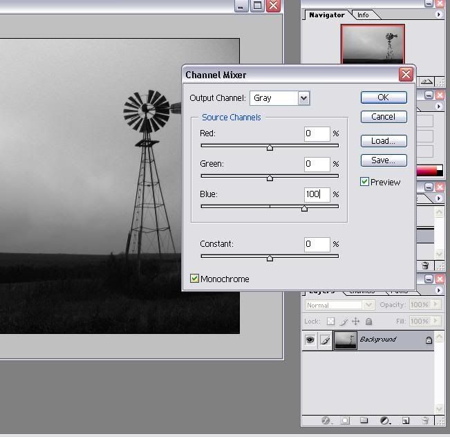
I clicked the box that says "Monochrome," set the blue channel to 100 and the red channel to 0.
But there was still a bit too much range for my liking. So I went to Image > Adjustments > Brightness/Contrast.
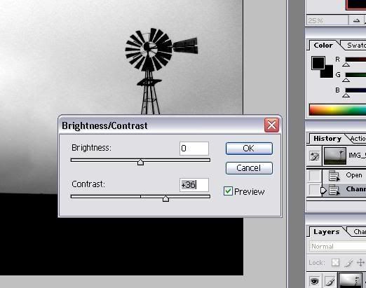
Then I messed with the contrast slider. If you jack it all the way up, you’ll ruin your image completely. I played with it so that the contrast was as high as possible without losing much texture in the clouds. For this picture, that sweet spot was at +36.
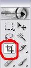
But now the image had too much dull area at the bottom. When there was some detail in the field, it added some interest to the image. But now that the contrast has been jacked up, it’s just dull and boring. I want to keep some of it, but I took a little bit out with the cropping tool (the letter "C" on your keyboard, or the icon in the toolbar that’s circled in red in the above picture).
At this point, I had done everything needed to the picture to get the nice silhouette and composition that I liked. But I wanted to give it a little something extra, so I went to Image > Adjustments > Variations.
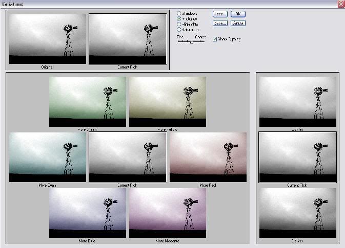
And then I messed with that until I got something I liked. When you’re doing this to a silhouette, chances are you’ll only want to adjust the midtones and highlights, but not the shadows. Remember not to go overboard, or it’ll just look goofy. You could do the same thing by going back to the Channel Mixer (remember this time not to check the box that says "Monochrome") but I think this method is easier and precise enough.
Here’s the final result:
I’m happy with it. Why don’t you go out and find something with an equally iconic shape and do the same thing, and share it with the group?
posted by Full Metal Attorney @ 8:51 AM
1 comments
![]()

1 Comments:
Great Info you have here. Thanks
Post a Comment
<< Home