How-To: Split Toning
Take a look at these black and white pictures.
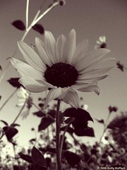
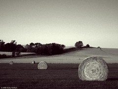
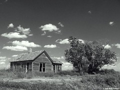
They look pretty nice, don't they? The secret is, they're not exactly black and white. They use split toning to achieve an extra bit of contrast and overall pleasing tone. People have done it for decades in the darkroom, and you can do it with your black and whites, too.
EDIT: Split toning is the application of different color casts to different tonal ranges in the photo (e.g. the shadows and highlights).
The first step is to open up your picture in Photoshop. If it's already a black and white, you're golden. If it's not, then let's convert it to black and white first. My favorite method goes as follows:
1. Look at the "channels" tab in your layers palette. See which channel has the best look for your photo, the red, the green, or the blue. Maybe two of them have some elements that you like. When you get it figured out, click back on the layers tab.
2. Go to Image > Adjustments > Channel Mixer. Click the box that says "Monochrome," and then adjust the sliders however you want. If the red channel looked the best, leave it as is, otherwise move the sliders to where your pic has the best overall look. Make sure the numbers add up to 100. When you're satisfied, click OK.
3. If your image is now too dark or too light, now's the time to fix it by going to Image > Adjustments > Levels.
Now that we're all up to speed with the black and whites, it's time for the split toning.
1. Go to Image > Adjustments > Variations.
2. Make sure the box that says "Show Clipping" is not checked. Normally it starts out checked, so turn it off. (I honestly have no idea why this is, but it's how it was explained to me.)
3. Now, unlike the effect I showed you in the post on silhouettes, this time we want a subtle effect. So take the slider there all the way down to the "fine" end.
4. Now, for the fun part--the real split toning.
4.a. Click on the "shadows" button first. Think about color theory here. Warmer colors, such as red and yellow, tend to pop out a bit more, while cooler colors tend to recede into the background. If you want the darker areas to pop out, try using red or yellow. Most likely, however, the darker areas will be further back into the picture, so try magenta or blue, or maybe green. Just do two to four clicks in the box you've chosen.
4.b. Now click on the "highlights" button. We'll leave the midtones alone, because changes there will be too obvious. Think about the color you chose for the background, and again think about color theory. Combinations that I've found work well are
- blue shadows, cyan highlights (particularly in pictures of snow and ice)
- green shadows, blue highlights (as in "Jack's Place" above)
- red and/or magenta shadows, yellow highlights (as in the other two pics above, in which I used a little bit each of red and magenta for the shadows)
And of course you can play around with different combinations. Start out with two to four clicks here as well.
5. Now, click OK. If you're unhappy with your picture (wrong colors, too much color, too little color), undo (Ctrl+Z) and go back into variations to try it again. My suggestion would be to save it as the original filename plus a letter/number, such as IMG_0001_a, then undo, go back into variations and try a different method, then save the new one as IMG_0001_b, and so on, to find the one you like best.
6. The final step is to share your results with the group!
(Note: I must give many thanks to Popular Photography & Imaging Magazine, where I learned about this technique. While my article closely follows their instructions, it is not a copyright violation because I only copied facts, not the expression of those facts. This article also incorporates my own observations, opinions, and advice.)
posted by Full Metal Attorney @ 9:00 AM
4 comments
![]()

4 Comments:
Interesting. By split toning you mean applying different colouring to the shadows and highlights? I hadn't heard of the term before, and as it is a subtle effect and there was no definition it wasn't clear from your photos and article what it was (and don't have photoshop so can't follow your instructions to find out!), so had to look it up.
Thanks for letting me know that was unclear. I have edited the post to clarify.
Hmm... that is interesting. Thanks!
I discovered this effect all by myself a few months back, something of which I am immensely proud. Only just now found out what it's called, though. I was wrongly calling it duotone at first, then I found out that's something else altogether, so for ages now I didn't know what the technique was called.
Anyway, I do it quite differently. My method is like this:
1: Get your B&W image. Duplicate layer.
2: Crank up the blue/cyan in the shadows on the background layer.
3: Select top layer, adjust opacity to about 50% (more or less according to taste).
4: Crank up yellow/magenta in the highlights on the top layer.
I find I get results that are rather more extreme than the pics you've posted. But that's what I'm aiming for.
Oh, before I forget, something else I discovered that's pretty awesome - I assume Photoshop has the wind effect, yes? I use GIMP. Anyway, this is buckets of fun: apply a wind effect to each of the two layers, with equal strength and threshhold, but with one going to the right and the other going to the left. If you've selected "leading" then you'll get a weird sparkly effect, whereas if you've selected "trailing" then the result looks like a very well drawn cartoon.
Post a Comment
<< Home