Assignment 2: Light and Shadow
Previous Assignment: Basic Composition and the Rule of Thirds
I hope you learned something from the first assignment. If you haven't completed it yet, I suggest that you read it and try it out.
For this assignment, I want to recommend again that you use black and white film or switch your digital camera to black and white mode. On my digital camera, I can't switch to black and white if it's in automatic mode, so if your camera is like mine, it's time to stop cheating! You may need to switch to aperture priority mode, or shutter priority mode (I shoot almost exclusively in aperture priority mode--read your manual for details if you don't know how to do this). If you can't figure out how to do this, you will still be able to complete the assignment, but I don't think you'll be as pleased with the results (and you won't learn as much).
Part 1: Shadows as Distinct Design Elements
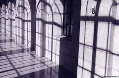
For the first part of your assignment, I want you to shoot a roll of film (or about 24-27 shots). For every one of these shots, I want you to go out and find a scene where shadows make interesting patterns or shapes. Don't forget the rule of thirds!!! If you can't follow it perfectly, that's ok.You'll have the best luck with this assignment if you shoot when the sun is out and the light bright, but not directly overhead (don't shoot between 11:00 a.m. and 1:00 p.m). You may need to decrease the size of your aperture (in other words, increase the f-number) so you don't over-expose the picture.
Here are some examples from my work:
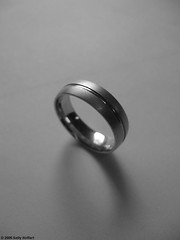
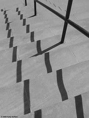
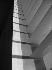
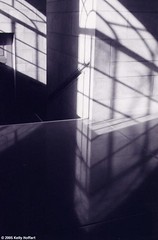
I guess I tend to do these a lot in verticals. You won't have to do it that way. You'll notice that this technique often works best when there isn't a lot of detail in the image, so that the shadows stand out better. This is a good thing, because working in strong light can wash out details. Finally, here's an example of a horizontal:
Part 2: Distinctive Lighting
After you finish part 1 of this assignment, I want you to shoot another roll (or 24-27 shots), preferably again in black and white. This time, I want you to look at light and shadow as a tool to emphasize the elements of your picture and evoke a mood, rather than using them as a distinct design element.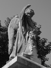
Here's a good example. Note how the interplay of light and shadow emphasizes the wings and the folds of the robe, while draping the angel's face in shadow, lending an element of mystery.
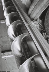
Here's another example. Here the light and shadow emphasize the repetition of a pattern (repetition of patterns is a good subject for a future post). They also help to give character to the shape of the auger.
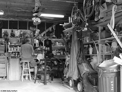
And finally, note here how the light in the lower left hand corner draws your eye into the image. This picture is a little busy--try to avoid that, as a rule, but sometimes it can be used to good artistic effect. But do note how the business of this picture makes it somewhat less pleasing than the above two pictures. In photography, less truly is more.
Now it's time to go out, shoot, and share!
Next Assignment: Illusions and Reflections

0 Comments:
Post a Comment
<< Home