Advanced Composition and the Golden Ratio
This isn't really intended to be an assignment, but if you take all of this in and try to put it into practice, it will vastly improve your compositional skills.
Power Points
You already know about the rule of thirds, but let's talk about it in more detail.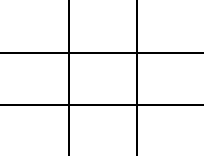 Here again is a diagram of a frame divided into thirds. You already know that placing different fields of interest into one third or two thirds of the frame will make a compelling interest. What you may not already know is about the existence of power points. The power points are the places where the lines intersect. Positioning an element onto one of these points is a powerful tool in photography.
Now, there is some play in this, meaning that you don't have to be exact with it. But the point is that placing elements in one of the corners, rather than in the center, is much more aesthetically pleasing. The following two pictures will show power points in action:
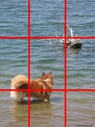
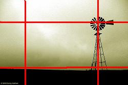
Notice how the head of the windmill and where the windmill touches the ground are both on power points, and the dog and branches are also both on power points.
The Golden Ratio
What is the golden ratio? Well, this Wikipedia article could give you a long mathematical explanation, but let's just say it's the mathematical formula for aesthetically pleasing composition. It's the reason the rule of thirds works. But there are many photographs that don't follow the rule of thirds, but the composition is still pleasing. The golden ratio accounts for that.You see, the rule of thirds is simply one manifestation of the golden ratio. The golden ratio is, so to speak, the golden rule of photography. To use it in your photos, it's much easier to break it down into specific applications, such as the rule of thirds. In fact, the rule of thirds is a manifestation of the golden rectangle (Wikipedia article on the golden rectangle).
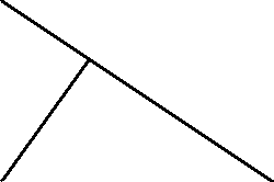 Another application is the golden triangle. To use this as a compositional guide, you have to imagine lines going through the frame so that they form equi-angular triangles, that is, triangles with the same angles in them (different sizes, but always the same shape). The diagram at left shows what this looks like, but you can add more and more lines conceptually if you wish, as long as the angles always remain the same. The following images all have a nice composition, but they do not appear to follow the rule of thirds. The golden triangle is a much better way to conceptualize them.
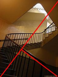
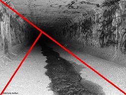
The area just inside the point of the smallest triangle is sometimes called a cradle. This is often seen as a good place in the frame to position the elements of your picture. Let's go back to the windmill photo.

As you can see, if the lines are drawn correctly, the cradle is in the same spot as the power point. This is not just a coincidence.
 The final compositional tool based on the golden ratio is called the golden spiral (image from the Wikipedia article). This is probably the most pleasing of all of these tricks, if used expertly. It's the reason that spiral staircase photos and photos of snail shells are so appealing. But it's not limited to those contexts. It's also another way to look at photos that utilize the golden triangle. And it's always another tool that you can use. The more tools in your toolbox, the more situations you can deal with effectively. Here are two examples of the golden spiral (I had a little trouble superimposing the spiral onto the pictures, so you'll just have to use your imagination):
On the first one, you can even imagine the spiral coming from one of two ways. The better one is from the bottom left corner, but you can also imagine it starting in the top right corner.
I hope that this will expand your horizons, and help you to look at photos in a new light.
posted by Full Metal Attorney @ 7:55 AM
9 comments
![]()

9 Comments:
The last two photos, illustrating the spiral, are broken.
I think the windmill photo is not the best illustration of the rule of thirds - you've had to draw the red lines some way off one third from each side to get them to intersect at the points of interest.
Actually, they're not broken. Flickr has just been having some problems this morning, but I appreciate your letting me know.
And in re the windmill, as I said it doesn't have to be exact, and they're only about 5-10% off the mark. But I thank you for your criticism.
the tips you have provided are really helpfull for amateur photographers like me!
Thanks! I'm glad it's helping.
Just found this post, and am bookmarking it. Many thanks for the info!
I was referred to this course from Fotofanatic. This is a great and clear demonstration, thanks for it. JJ
I had never heard of the golden triangle until i was reading about the 'Golden Section plugin'. Curious I googled golden triangle and it landed me here. Thank you for sharing this information. Very helpful. I will be using this information soon for my photographs and posting about it with reference to your page. I will also be linking this article in my blog links.
I've wanted to remind myself of what this was so this has been helpful, thanks
The point for others reading this is that though they call these rules they are in fact guides. Often you will compose an image or see an image that appears balanced, it likely meets the the thirds or golden ration guidelines.
Again when composing its good to think of this when looking through the viewfinder but the key is not get hooked up on it meeting these guides perfectly, roughly is fine. I find sometimes its worth taking multiple images of the same scene slightly differently composed, the first always a natural quick composition and others thinking about the guides. When back on the computer look at each and see what feels best then apply the virtual thirds, powerpoints or golden ratio to the image and see how it comes out.
I enjoy this post very much. thanks for the help as I aml earning ever yday .The only thing I can add is my motto. :as seen through my eyes; that is what photohraphy is to me
Post a Comment
<< Home