Monday, October 30, 2006

History of Photography: Niépce to Eastman

I'm not sure how much this will actually help you in your photography, but it is interesting to know the early history of photographic technology.

For centuries artists have used the camera obscura as an aid to drawing. To make one, all you need do is poke a pin-sized hole into a box. Light will travel through the hole and project the scene from the other side of the box onto the back of the box or an object placed inside it.. Artists using this technique would then sketch what shapes fell onto the target area.

Then along came Nicéphore Niépce. In 1826 he produced the first photographs using a camera obscura and chemicals in paper. His techniques produced a positive image on paper. They took hours upon hours in direct sunlight, and produced the image at the same time as the paper was exposed. At right you can see his earliest surviving image.
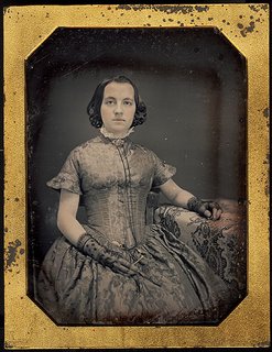
Louis Daguerre, another Frenchman, teamed up with Niépce, and together they refined the process. After Niépce's death, Daguerre continued to work. He discovered a way to make a latent image on the target object, which was later developed. In 1839 he introduced the Daguerreotype: a positive image on a copper plate. These were very high-quality images (see image at left), but since they were positive images they couldn't readily be copied. In this way they are much like Polaroids, except they are much more archival, as long as you don't scratch them (which is quite easy to do). Many of these images still survive today, and can fetch quite a price. On eBay at press time the beautiful picture at left is available, and bidding is currently at $208.50.

About the same time, William Fox Talbot was working on a process to make negative images that could later be printed into positives. His process was called calotype. They were not as high-quality as the Daguerreotypes, and not as long-lived either.
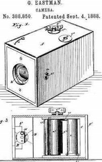
Many others contributed to this process over time. Not the least of which was George Eastman, founder of Kodak, who introduced a camera that was preloaded with a roll of film (about 100 exposures) and was turned into the company to be developed, not unlike the disposable cameras of today (diagram at right). They didn't have a viewfinder of any sort, but despite this flaw it made photography available to the general public at the then-quite-expensive but still affordable price of $25, inclusive of processing. The slogan: "You press the button, we do the rest." And the rest is, as they say, history.
Thursday, October 26, 2006

Assignment 8: Leading Lines

Previous Assignment: Putting It in Perspective

I found a nice way to explain the topic, leading lines, over on Kodak's web site:
Select a camera angle where the natural lines of the scene lead the viewers' eyes into the picture and toward your main center of interest. You can find such a line in a road, a fence, even a shadow. Diagonal lines are dynamic; curved lines are flowing and graceful. You can often find the right line by moving around and choosing an appropriate angle.
You can find a lot of good examples of this in the post on perspective, particularly the part on linear perspective, but here are a few examples of the technique:

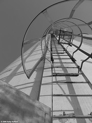
Ladder on Grain Elevator

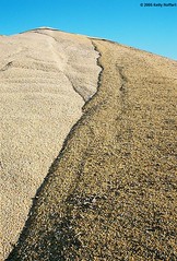
Corn Mountain

Notice how the lines lead your eye into, and not out of, the picture, just as action should always lead into the picture. One of the best ways to do this is to start your leading line in the corner, as in the corn picture above. The corner is a place where the eye can easily wander out of the frame, and it's your job to draw the eye back in. You need to be careful, though, because you don't want it to go directly into the corner. That will lead the eye out. But you do want it to start very close to the corner.

A good way to judge whether you are using your leading lines effectively is to just sit and look at your picture, relax, and let your eye move where it will. Take this picture, for example:

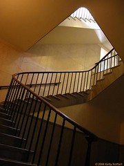
Stairwell in Nebraska State Capitol

Notice how your eye immediately wants to start in the lower right corner, and the railing leads your eye across and into the picture, but doesn't lead your eye out. Then it leads your eye up and to the right for a while, but the edge of the ceiling saves your eye from going out, leads your eye around and back down. This picture is a particularly good example of the use of leading lines because the lines draw your eye to every facet of the picture and keep your eye in the frame.

Leading lines are an excellent tool for portraiture, as well. When posing your subject, it's a good idea to use their arms, or some object, as a leading line. And it's a good idea to remember the golden triangle, as it's quite good for portraiture. See this example:


Notice how the elbow follows along with the golden triangle's lines, and it starts a leading line that leads up to the face. Just in case your eye wasn't sure where to go, the hilt (or tsuka) of the katana also draws your eye to the face. Notice also that the scabbard (or saya) is dark enough to be almost unnoticeable, so it doesn't draw your eye out of the frame. When doing portraiture, the face (and especially the eyes) are where you want the leading lines to go.

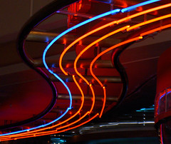
Leading lines are generally most effective when they are diagonal or curved, rather than horizontal or vertical. However, the best leading lines of all are the elusive S-curves. I don't have any good examples from my own work, but here are a couple from other people that I thought were awesome examples:


(by cobalt123)


(by ikonjon)

Aren't those last two amazing? I think so.

So why don't you go out, shoot, and share?

Next Assignment: Critique

Tuesday, October 24, 2006

Always Take Your Camera

Always take your camera with you. I keep telling myself this, but I don't practice what I preach.

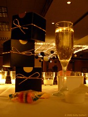
Boxes and Champagne

This picture has loads of potential. But I took it with someone else's camera, and didn't know how to ensure that the focus would be up close. So it's blurred. It's good enough that a professional wedding photographer wanted to take the same picture, but it's fatally flawed by the blur. Sure is a nice focus on the background, though . . . .

Learn from my mistake, even if I don't. Take your camera with you wherever you go.

Did you ever wish you had your camera?

Sunday, October 22, 2006

David Bailey, on Photographers Versus Painters

It takes a lot of imagination to be a good photographer. You need less imagination to be a painter, because you can invent things. But in photography everything is so ordinary; it takes a lot of looking before you learn to see the ordinary.
--David Bailey

Thursday, October 19, 2006

Advanced Composition and the Golden Ratio

This isn't really intended to be an assignment, but if you take all of this in and try to put it into practice, it will vastly improve your compositional skills.

Power Points

You already know about the rule of thirds, but let's talk about it in more detail.

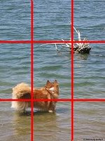
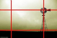
Here again is a diagram of a frame divided into thirds. You already know that placing different fields of interest into one third or two thirds of the frame will make a compelling interest. What you may not already know is about the existence of power points. The power points are the places where the lines intersect. Positioning an element onto one of these points is a powerful tool in photography.

Now, there is some play in this, meaning that you don't have to be exact with it. But the point is that placing elements in one of the corners, rather than in the center, is much more aesthetically pleasing. The following two pictures will show power points in action:

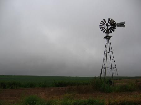
Notice how the head of the windmill and where the windmill touches the ground are both on power points, and the dog and branches are also both on power points.

The Golden Ratio

What is the golden ratio? Well, this Wikipedia article could give you a long mathematical explanation, but let's just say it's the mathematical formula for aesthetically pleasing composition. It's the reason the rule of thirds works. But there are many photographs that don't follow the rule of thirds, but the composition is still pleasing. The golden ratio accounts for that.

You see, the rule of thirds is simply one manifestation of the golden ratio. The golden ratio is, so to speak, the golden rule of photography. To use it in your photos, it's much easier to break it down into specific applications, such as the rule of thirds. In fact, the rule of thirds is a manifestation of the golden rectangle (Wikipedia article on the golden rectangle).

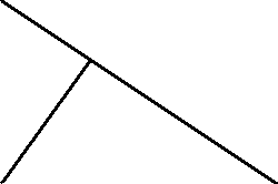
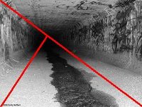
Another application is the golden triangle. To use this as a compositional guide, you have to imagine lines going through the frame so that they form equi-angular triangles, that is, triangles with the same angles in them (different sizes, but always the same shape). The diagram at left shows what this looks like, but you can add more and more lines conceptually if you wish, as long as the angles always remain the same. The following images all have a nice composition, but they do not appear to follow the rule of thirds. The golden triangle is a much better way to conceptualize them.


The area just inside the point of the smallest triangle is sometimes called a cradle. This is often seen as a good place in the frame to position the elements of your picture. Let's go back to the windmill photo.

As you can see, if the lines are drawn correctly, the cradle is in the same spot as the power point. This is not just a coincidence.

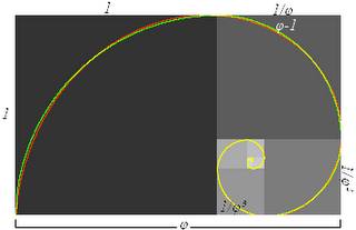
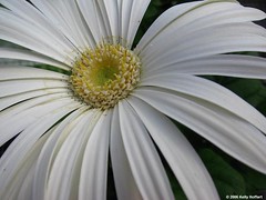
The final compositional tool based on the golden ratio is called the golden spiral (image from the Wikipedia article). This is probably the most pleasing of all of these tricks, if used expertly. It's the reason that spiral staircase photos and photos of snail shells are so appealing. But it's not limited to those contexts. It's also another way to look at photos that utilize the golden triangle. And it's always another tool that you can use. The more tools in your toolbox, the more situations you can deal with effectively. Here are two examples of the golden spiral (I had a little trouble superimposing the spiral onto the pictures, so you'll just have to use your imagination):

Untitled

White Gerber Daisy

On the first one, you can even imagine the spiral coming from one of two ways. The better one is from the bottom left corner, but you can also imagine it starting in the top right corner.

I hope that this will expand your horizons, and help you to look at photos in a new light.

Monday, October 16, 2006

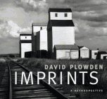
Inspiration from David Plowden

A friend of mine gave me a book, Imprints, by David Plowden, with the following note scrawled on the inside cover:
Kelly,
I know you’ll be inspired by these images.
Keep up the good work!
-- Todd Morten

Well, not only have the pictures inspired me and even affected the way I look through the camera, but the words have inspired me as well. David Plowden is gifted in that he not only communicates well with a lens, but also with a keyboard. I'll share many of the things he wrote in that book with you, but the most inspirational story I've ever heard about photography, one to which I relate, was written in the pages of that book, and I'd like to share it right now.
Many years ago when I was crossing Kansas on a train, I went to the dining car for lunch. Once there, I discovered to my horror that all the window blinds had been pulled down. The steward seated me, and I immediately raised the blind so I could look out on the immensity of the flatlands . . . . A moment later the steward reappeared, reached over, and pulled the blind down again, assuring me that “there’s nothing out there to look at, son.”
Perhaps not to his eye, but certainly to mine. I raised the blind once more and have never lowered it since.
--David Plowden, on "The Flatlands," in his book Imprints

Thursday, October 12, 2006

How-To: Silhouettes

Instead of an assignment this week, I thought I’d share the story behind a picture, and maybe you can learn something about silhouettes from it.

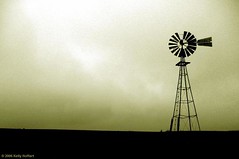
I took this back in August. I knew there was something I liked about it, but as you can see it’s terribly flawed: an almost complete lack of contrast. If you’ll remember the post on light quality and quantity, you’ll recall that too little light means too little contrast, and that’s the problem here. I had let it simmer for some time, hoping that I could figure out something to do with it.

I did.

I decided to turn it into a silhouette. I’ve seen many silhouette pictures. Many of them work. Many don’t. Why is it that some silhouettes are compelling, while others are dull? The answer is simple. Compelling silhouettes are easily recognizable, stark shapes. A windmill is perfect--Nebraska license plates had a windmill silhouette on them for years; they’re probably the most iconic structure to symbolize life on the plains. But the windmill here is only one example; others include people, some landmarks (e.g. the Eiffel Tower or the Washington Monument), fences, birds, and some other animals. There are many more to pick from. Contrast that with trees. Most trees almost never make a compelling silhouette, although there are exceptions.

The old-fashioned way to get a silhouette is to get a strong light source behind your subject, like in these images:
North and South Skyscape with Capitol
Sunrise and sunset are often the best times to do this. When you do it, it's a good idea to bracket (take a picture at the exposure your camera tells you, then another two stops lower and another two stops higher). But that’s not always an option, and here I’m trying to save an almost-good picture, not start from scratch.

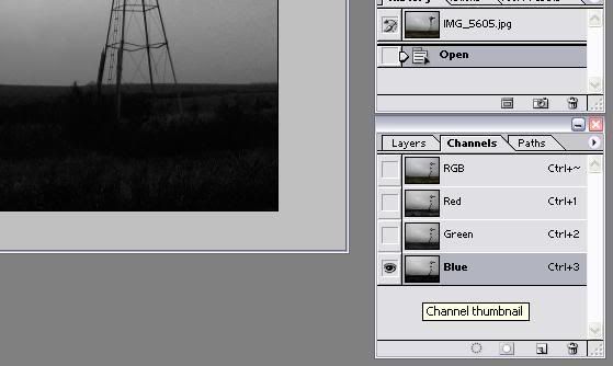
So I opened up the picture in Photoshop. I wanted to change this to a black and white image first, to get the most mileage from going in the stark direction of a silhouette. But I wanted to change it to black and white in the best way possible. To figure that out, I went to the "Channels" tab in the "Layers" palette.

Here, I was looking for the channel that had the least range of values, i.e. a lot of black and white but not a lot of gray. I clicked red, green, and then blue, and found that the blue channel was what I was looking for. Most of the time, the red channel will have the most range and the blue channel the least, so this is no surprise.

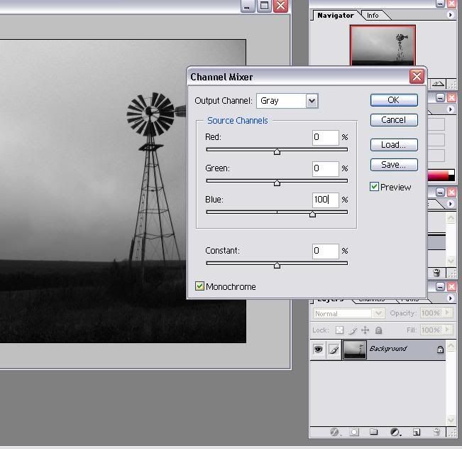
Then I went to Image > Adjustments > Channel Mixer.

I clicked the box that says "Monochrome," set the blue channel to 100 and the red channel to 0.

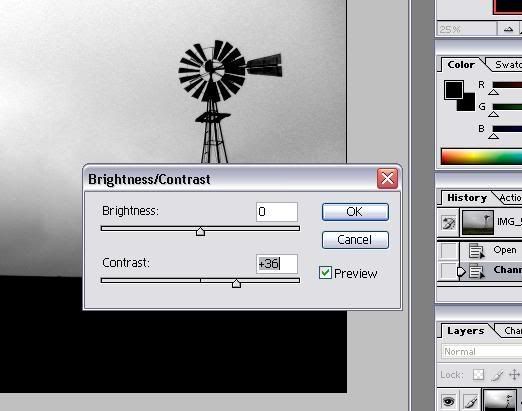
But there was still a bit too much range for my liking. So I went to Image > Adjustments > Brightness/Contrast.

Then I messed with the contrast slider. If you jack it all the way up, you’ll ruin your image completely. I played with it so that the contrast was as high as possible without losing much texture in the clouds. For this picture, that sweet spot was at +36.

crop
But now the image had too much dull area at the bottom. When there was some detail in the field, it added some interest to the image. But now that the contrast has been jacked up, it’s just dull and boring. I want to keep some of it, but I took a little bit out with the cropping tool (the letter "C" on your keyboard, or the icon in the toolbar that’s circled in red in the above picture).

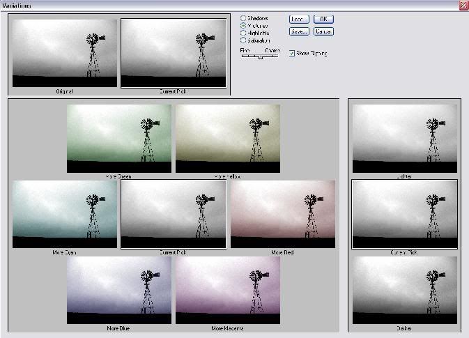
At this point, I had done everything needed to the picture to get the nice silhouette and composition that I liked. But I wanted to give it a little something extra, so I went to Image > Adjustments > Variations.

And then I messed with that until I got something I liked. When you’re doing this to a silhouette, chances are you’ll only want to adjust the midtones and highlights, but not the shadows. Remember not to go overboard, or it’ll just look goofy. You could do the same thing by going back to the Channel Mixer (remember this time not to check the box that says "Monochrome") but I think this method is easier and precise enough.

Here’s the final result:

Windmill Silhouette

I’m happy with it. Why don’t you go out and find something with an equally iconic shape and do the same thing, and share it with the group?

Wednesday, October 11, 2006

How-To: Light Trails

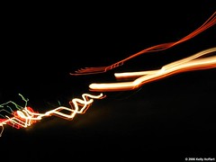
I thought I'd share a quick how-to with everyone. Light trails can make some interesting shots. To get them, all you need to do is get in as dark an area as possible and use a longer exposure, and then find (or make) moving lights. You could do this in a pitch-black room with a tripod and move a flashlight or, preferably, LED lights, or anything else like that (if you're moving the light yourself, you might want to use a timer on your camera so you can get in position before the shutter opens). Or you could go out on the street and find some moving cars, like I did on this shot:

untitled

Since you have a lot of leeway on creativity with this trick, you don't have to even use a tripod, or even stand still! If you want, you might try experimenting with moving the camera instead of the light source. That's what I did here, but my light sources (car lights) were moving as well. I used a two second exposure, held the camera in my hand, and just walked down the street with the camera pointing at the cars. My walking is what gives this picture its rhythm.

Have you ever tried this kind of shot? Share it!

Monday, October 09, 2006

Image Stabilization

In the most recent issue of Popular Photography & Imaging magazine, the had a feature on doing wildlife photography. One of their recommendations is to get a 500mm lens with optical image stabilization. You don't even want to know how much that costs . . . but if you want to play the guessing game, you might want to start at $5,000.

But that's not the point I want to get at here. Optical image stabilization, a technology apparently introduced by Canon, is the point. I believe some earlier technologies were digital, so you can imagine how bad they were. This one works differently.

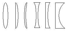
A camera's lens is made up of several pieces of glass, called elements. They might look something like this sloppy diagram I made in MSPaint (I was basing this diagram on the elements of a microscope, so the picture isn't entirely accurate, but you get the idea). The light travels through all of the elements before it hits the film or digital sensor.

Normally these elements don't move. But with optical image stabilization, they are allowed to float a little bit in such a way that it doesn't matter if the front elements shake a little bit.

At first I put the idea out of my mind, thinking that it couldn't make much of a difference. But Canon claims that it makes a two stop difference. That is, if, with your focal length, you could shoot without shake at 1/500 of a second without image stabilization, you could shoot without shake at 1/125 of a second with it. This means, the way I figure it, that you could potentially handhold a 500mm lens under some fairly weak lighting conditions, especially considering that such a lens probably doesn't have a very wide aperture (many are limited to about f5).

So if you're looking into buying a new lens, especially a longer one, I would definitely consider looking into Canon's new technology.

Sunday, October 08, 2006

Another Point of View

Just to prove that I know I'm not always right, and not all photography advice applies equally to all styles of photography, here's a quote from a true master of photography who would think I'm dead wrong in regards to my post Don't Be a Wuss:
There is a lot of talk about camera angles; but the only valid angles in existence are the angles of the geometry of composition and not the ones fabricated by the photographer who falls flat on his stomach or performs other antics to procure his effect.
--Henri Cartier-Bresson (1908-2004)

In fact, there's a good chance he's laughing at me from beyond the grave. I'll just laugh at him because he's French, and dead. No, I won't laugh at him for being dead. He was truly a great photographer.

Thursday, October 05, 2006

Assignment 7: Putting It in Perspective

Previous Assignment: Less Is More

An excellent device for creating an interesting image is to use perspective. If you can look at a photo, and your eye follows it into the background, it's very pleasant to look at it for a long time.

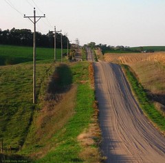
One way to give a picture perspective is to use linear perspective. When you look at a scene, a road, for example, the lines converge toward the middle. Here are a few examples:

Gravel Road, South of Pierce, Nebraska
Into the Darkness Untitled Converging Tracks

Another way to use perspective is to find a truly unique one, by lying down on the ground or whatever you need to do to show an ordinary scene in an extraordinary way. Of course, this isn't what is usually meant by expert photographers when they use the term "perspective," but I think it's conceptually related to these other kinds of perspective. Sometimes, all you need to do is tilt your camera, but often it's better to get above or below whatever you're looking at. Examples:

Ladder on Grain Elevator
Berry Blue Kool-Aid with Twizzler Straw Drawers Self-Portrait Katana Lying on Bookshelf Jack Daniel's

Notice that the ladder and drawer pictures also use linear perspective. Always remember that combining different photography techniques will create very compelling images.

And a final way to effectively use perspective is to think about the picture in terms of foreground, middleground, and background. This last trick is called spatial perspective. This is one of the areas where Ansel Adams really excelled, and honestly I'm not very good at it yet. It's probably the most difficult to use of all these tricks. But the idea is that you should find something interesting to put in the foreground, something interesting in the middleground, and something interesting in the background. This gives the picture a great feeling of depth in a more natural way. When you do this, you'll want to use a tight aperture (high f-number) to get detail at all levels, and using a wide angle lens would be ideal. An example:

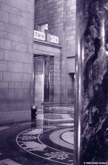
Capitol with Marble Pillar

I'm kind of disappointed in myself that my best example of this is over a year and a half old. But notice how the column is the foreground, and it gives a frame of reference, then the wall on the left and the patterns on the floor are the middleground, and the rest is the background. It gives a feeling of depth without forcing it, as the converging lines of linear perspective do.

Spatial perspective is most effective when the foreground elements are easily recognizable (such as a person, car, door, or tree) so that they serve as a reference point. This gives the viewer a sense of the scale of everything in the picture. You can use it without easily recognized elements in the foreground, but this does make it more effective.

Two more examples (not as good as the first):

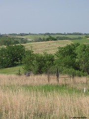
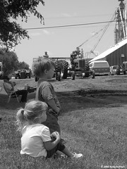
Field Near Denton, Nebraska Kids at the 2006 Edgar Tractor Pull

In the first of these, the foreground is the fence, the middleground is the first hill, and the rest is the background. It would be better if I had gotten in closer to the fence. In other words, this one has a weak foreground. In the second one, the kids provide the foreground, the man in the chair and the tractors are the middleground, and the grain elevator and building are the background. This one, however, has a weak background. On the plus side, both of them do use an easily-recognizable foreground element that gives the picture a sense of scale.

If you go back to my first example for linear perspective (the gravel road), you'll find that it also is a flawed example of this type of perspective, lacking a powerful foreground. Also, if you go back and look at the picture of Jack Daniel's paraphernalia, you'll see how spatial perspective can be used to fool the viewer instead of giving them a true sense of scale. It looks like a liter bottle, doesn't it? If you look closely, you'll see it's 375 mL.

So it looks like I have some work to do as well! Try to use all three kinds of perspective, then show me what you get!

Next Assignment: Leading Lines

Wednesday, October 04, 2006

When You're Ready to Sell Your Work

When you're ready to sell your work, there are many different avenues you can choose.

Fine Art Sales Online

The cheapest and easiest avenue to try is the Internet. Art.com is one example. Free accounts are allowed to upload up to 16 pictures, and make them available for printing directly from the site. You only get 10% of the revenues, but it can add up if you make enough sales. This site is great because the prints are high quality and they look at pictures for artistic merit rather than technical quality.

Stock Photography

Of course, there are also more commercialized avenues, such as Fotolia and Shutterstock. These are great if your pictures are of pristine technical quality and have great commercial potential. There are also other stock photography sites, some of which use a more complex fee arrangement, but many of those are harder to get your foot in the door and have less reliable results.

Galleries

I've been looking into some local galleries, and if you really think you're good enough, you should too. They will want to see a portfolio of your work, but don't put something together like "my best pictures" or anything like that. They'll like to see a more cohesive portfolio, something with a theme, that would make a good photo book or exhibit. Try something along the lines of "Country Landscapes" or "Black and White Abstracts" or something like that. These will, of course, require an investment (something I can't afford right now and that's why I haven't tried it yet). You'll have to make some prints and matte them, and maybe even frame them. That is, of course, if they accept you. Once I give this a shot, I'll let you know how it went and give you some more tips.

Your Input

Have you tried any of these avenues? Do you have any other good websites or other outlets to share, or any stories? Leave a comment here or in the Flickr group!

Monday, October 02, 2006

Falling Down, Skinning Knees, and Getting Dirty

If you remember my post entitled Don't Be a Wuss, you'll remember that I asked for stories. There are a few in this thread but I thought I'd share the best of the group with everyone. These stories come from Cornell Finch:
I am regularly scraping knees, elbows, chins etc to "get the shot".

This one for example i had my EOS mounted on a Manfrotto tripod, legs fully extended (as low as they go) to get down there. I took the shot and stood up, over balanced, tripped over the tripod and skinned my left elbow and knee (I was wearing shorts at the time).

This shot found me lying on the floor of a petrol station forecourt to get the angle. This was hand-held with a 50mm f1.8 lens. You can see from the shot that it was raining.
Thanks for the stories! I want this blog to be as interactive as possible, so always feel free to share your stories, thoughts, experience, and expertise!